

England's Batting Collapses: How Bad Are They Really?

“England cricket capitulations have gone from car-crash to commonplace” reads the headline from the Guardian’s Jonathan Liew. Former captain Michael Atherton writes that this is “the worst of a litany of horrendous collapses.” It is December 28th 2021, and England have been bowled out for 68 in Melbourne to hand Australia the Ashes.
Fans of English cricket will be all too familiar with the scene; England losing 3 or 4 early wickets, needing a miracle innings from captain Joe Root or talisman Ben Stokes to dig themselves out of the latest hole. Since the retirement of Andrew Strauss in 2012, England have struggled to find a functioning opening partnership. Coupled with the inability to find a replacement at number three following Jonathan Trott’s retirement, England’s batting order has become synonymous with batting collapses.
But just how often does England’s batting order collapse? Is it really as much of a problem as it’s made it out to be? How do England compare with other teams around the world? This article is focused on answering these questions, and more.
Defining a Collapse
Before diving into any data, we first have to define a batting collapse. Put simply, a batting collapse is the loss of many wickets in a short space of time and for few runs scored. Take England’s final innings of the recent Ashes series as an example: chasing 271 to win, England reached a respectable 82-1 before being bowled out for just 124, meaning they lost the final 9 wickets for just 42 runs. A stunningly bad collapse.
While we might know a collapse when we see one, in order to investigate this topic using data, we need to define a numerical cut off point for a collapse. Initially, I set this cutoff at losing 3 wickets for 30 runs or less. Having looked at the data on test match innings, I realised that using 3-30 as a cutoff meant that over 70% of all test innings since 2012 contained a collapse. That number is way too high and suggested that the cutoff I had set was too low, so it was revised to a higher bar of losing 4 wickets for 40 runs or less instead. The actual number used is somewhat arbitrary given that there is no widely agreed-upon numerical definition. If anyone has a reason why this number is wrong, let me know!
Method
To analyse test match collapses, I needed extensive test match data. I used web scraping to take information on every test match played since 2012 from stats.espncricinfo.com, including the teams, date, location, and outcome. I then scraped the fall of wicket (the number of runs the batting team has when each wicket falls) data for every test match. Combining these, I had a dataset consisting of one row for each innings in every test match played since 2012, including the batting/bowling team and the number of runs scored when each wicket fell.*
Next, I needed to calculate which innings contained a collapse and which did not. A note here: I decided to only focus on the first 7 wickets lost in any innings. Why? This is an analysis about batting. While bowlers are required to bat, that is not their primary function. I did not want to code an innings as having contained a collapse if the batting team got to 500-6 and the four bowlers were then bowled out for a combined ten runs. Runs by lower order batsmen are valuable, but they are not the focus of this piece. I am focusing on batsmen, so the calculations for whether a collapse occurred only accounts for the loss of the first 7 wickets.
To determine which innings contained a collapse, I calculated the number of runs scored between the 4th wicket and 1st wicket, 5th and 2nd wicket, 6th and 3rd wicket, and 7th and 4th wicket of each innings. If any of these numbers were 40 or below, the team would have, at one stage or another, lost 4 wickets for 40 runs or less. In that case, it would be coded as having a collapse. With this dataset, we can begin to analyse test match batting collapses since 2012.
*Throughout this analysis, innings in which Ireland, Afghanistan, and Zimbabwe are the batting team are excluded. These teams had played too few games to lead to any meaningful analysis about their performance, and the small sample sizes threatened to skew the results.
Summary Stats
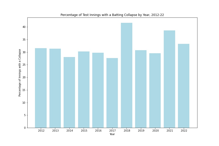
To start with, let’s look at some overall numbers. The first graph below shows the collapse rate (the percentage of innings containing a collapse) per year for all test match innings. As you can see, there is no clear pattern. Collapse rates typically sit at around 30%, with the highest (2018) just over 40%. While recent years have had some of the highest collapse rates, that trend is far from consistent.
Next, let’s take a look at collapse rates per match innings. Typically, you would expect the 1st innings of a match to have the best batting conditions, with the pitch deteriorating from then on and making batting harder. Thus, we should expect to see more collapses in later innings.
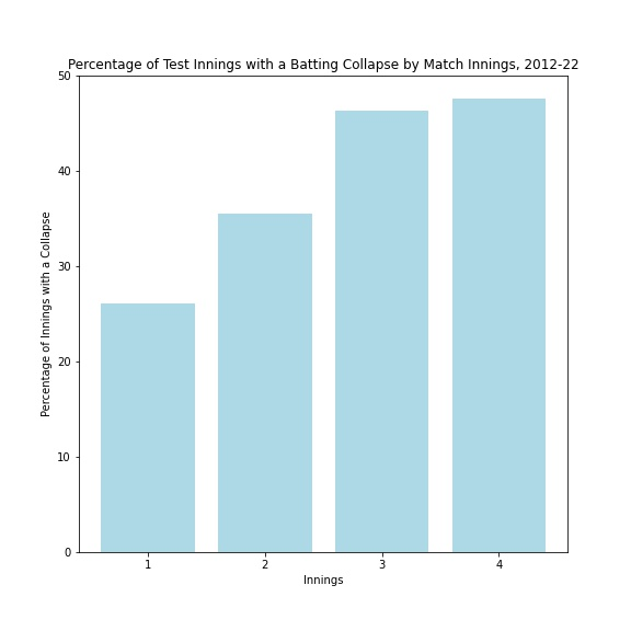
The expected increase as the match goes on is there, although the difference between innings 3 and 4 is very small. This is likely due to the fact that many 4th innings are cut short by the game ending. Finally for this section, let’s look specifically at England’s collapse rate per year since 2012. The general sense is that England’s collapses have become more frequent, so let’s see if that is borne out by the numbers.
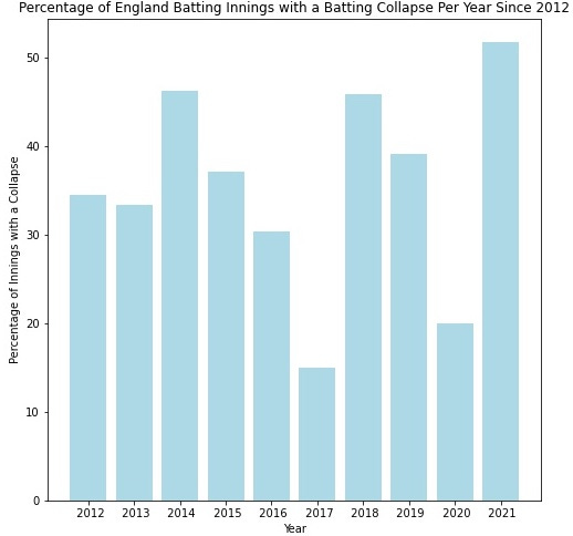
Well, 2021 was an historically bad year for England and collapses (which is probably unsurprising to anyone that has watched England in the last year). Other than that, any pattern is hard to define. The pandemic-affected 2020 number is very low, although that is likely impacted by a small sample size from fewer games being played. Taking 2020 out, there is perhaps an argument that England are collapsing more frequently since 2017, although it is hardly a certainty from this data.
The summary stats don’t tell us too much, so let’s delve deeper into the data to see how England compare to other Test teams.
Deep Dive Into Batting Collapses
The first and most basic comparison we can make is the overall collapse rate for different teams in all innings since 2012. This data is graphed below.
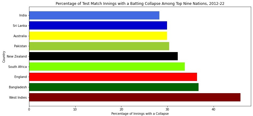
As you can see, England are 7th out of the 9 major test-playing nations, with a collapse rate of 36%. This compares to the very lowest rate of 28% for India and the overall global average of 33%. This data shows that England are a relatively collapse-prone team, with only Bangladesh and West Indies (two teams that have poor recent test records) below them. This does not suggest, however, that England’s collapse frequency is outlandishly high. We can break down the numbers to give us a more specific picture of not just the frequency of England’s collapses, but also the moments at which they happen. To do so, let’s look at the collapse rate of each team in each innings of the match. The image below shows four graphs for collapse rates in innings 1-4, with first innings in the top left and fourth innings in the bottom right.

What do we learn from these graphs? We learn that, when England bat first (meaning they bat in the first and third innings), their collapse rate is around average. They sit 5th out of 9 teams in both first and third innings collapse rates. When they bat second, however, the numbers are much worse; last out of all 9 teams in the second innings (with a collapse rate well over double that of India and Australia) and 7th out of 9 in the fourth innings. This suggests that batting first in any game is particularly important for England’s batting lineup.
So, we have learned that England collapse more than average overall, although they are not the worst team, and that the above average collapse rate is being primarily driven by poor batting performances in the second and fourth innings.
All of the graphs so far are based on data since 2012. Looking at matches since 2012 was done for two reasons: 1) it coincides with the retirement of Andrew Strauss and 2) ten years of data gives us a large sample size to overcome any short-term volatility (such as England’s historically bad 2021). However, the strongest criticism of England’s batting fragility has come in recent years, so let’s revisit the above graphs using test matches since 2017 to see if the picture changes.
First, an overall picture of collapses since February 2017 (when Joe Root took over as England captain):
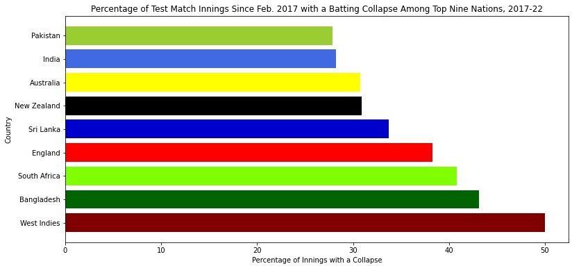
England’s collapse rate is slightly worse since 2017 (38% from 2017-22 vs 36% from 2012-22) but their ranking has improved, moving from 7th to 6th. This is reflective of a global shift of teams collapsing more often; the global average collapse rate has risen from 33.6% to 36.1%. England’s own collapse rate is just 2% higher than average since 2017, compared to 3% higher than average since 2012. This suggests that England have actually slightly improved relative to other teams, even if they remain worse than average.
Breaking it down by innings, the pattern of England performing badly when batting second remains; the collapse rate in the 1st innings is just 27%, ranked 4th in the world since 2017. In the second innings, the collapse rate jumps to over 40%, putting England at 8th in the world ahead of only South Africa. Collapses remain high in the fourth innings, too, ranked 7th out of the 9 nations.
Location, Location, Location
Test match cricket is a sport that changes massively depending on the conditions in which a game is being played. From green seamers in England to slow and low spinners in India to pacy hard surfaces in Australia, pitches present very different challenges in different countries. Given that conditions can change matches to such an extent, it makes sense to look at how the location of test matches impacts collapse rate. Perhaps England’s high collapse rate is due to the fact that they play most of their matches in England? To find out, let’s look at collapse rates based on the country in which a test match is played, rather than the team that is batting. (Note: Pakistan data includes ‘home’ tests for Pakistan played in the UAE).
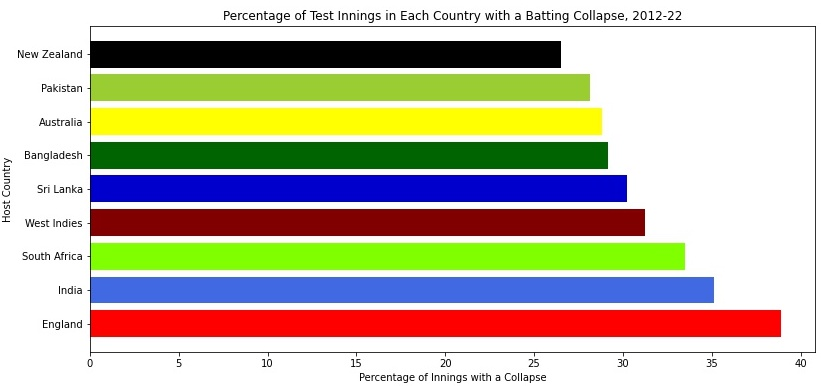
This graph is particularly telling - test matches played in England have the highest collapse rate of any country in the world, and by a comfortable margin over the next highest. The fact that innings in England have such high collapse rates suggests that the England team’s own batting struggles may be driven more by the conditions in which they play rather than batting frailty. It’s also possible, though, that test innings played in England feature such a high collapse rate because England’s batting is so collapse-prone. With the information we have so far, we can’t say for sure which way the causality is going. Are hard English conditions making England’s batting look bad, or is England’s bad batting making English conditions look hard?
To answer that question, let’s compare England’s collapse rate to the collapse rate of all other teams when playing in England. If England’s bad batting is making English conditions look hard, we would expect England’s collapse rate to be much higher than other teams. Below are graphs showing the collapse rate of England and all other teams when batting in England; first the numbers from 2012-2022, followed by just those matches played since Feb. 2017.
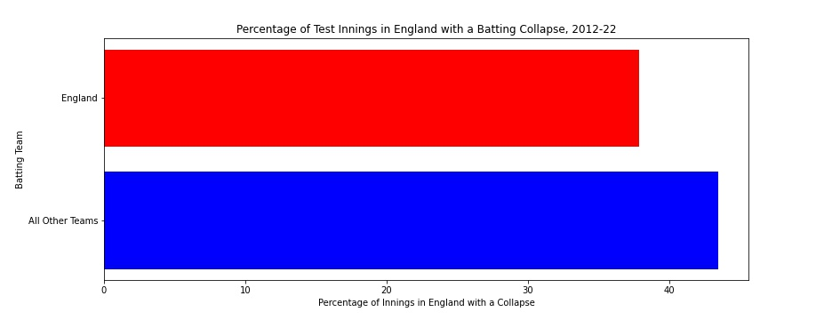
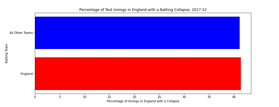
These two graphs make a powerful point: since 2012, England have collapsed less than the opposition when playing in England, and since 2017 they collapse at almost an identical rate. Based on this, we can conclude that the high collapse rate among matches played in England is because English conditions are hard for everyone, not because England’s bad batting are skewing the statistics.
So what does this mean for our general takeaway on England’s batting collapses? Well, it means that much of England’s above average collapse rate is likely caused by English conditions being hard for batsmen. We can confirm that because England have the highest collapse rate when playing at home of any team in the world, but are 4th best for collapse rate away from home (just above average). That is further evidence that much of England’s issues with collapses are driven by difficult conditions playing at home rather than any inherent issue with collapsing. Test matches in England simply feature more collapses than matches anywhere else in the world. If any team were to play most of their games in England, we would expect them to have a very high collapse rate, even if they are a strong batting team.
That is not to say that England’s batting weakness doesn’t exist or that they are a good batting team. The collapse rate when playing in England has markedly increased from 2017, while all other teams playing in England have reduced their collapse rate slightly. England’s batting in England has clearly got worse in the last five years, even when controlling for difficult conditions that they face. But the data does show that they are perhaps not as bad as we might be pre-disposed to believe. The worsening of their batting has simply taken them to collapsing at the same rate as others when playing in England, not significantly worse than opponents. That begs one final question: why do we view England as having such a calamitous record of collapses?
Human Biases Cloud Our Judgement
I have a few theories as to why we think England collapse at such an extreme rate:
Recency bias - It is important to remember that the data I have used throughout this piece is, intentionally, over a relatively long period of time. That means that the data overcomes short term volatility. However, humans don’t naturally think like that. Research in behavioural economics and psychology has shown that recent events weigh heaviest on our minds and are what we rely on most when predicting future events. When we think about recent England batting performances, collapses are everywhere. Just two of the 10 batting innings in this winter’s Ashes did not feature a collapse. As shown earlier, 2021 as a whole was a historically bad year for England’s batting collapses. It is easy to weight these recent performances more heavily than those from a few years ago, especially since 2021 featured ‘marquee’ series against India and Australia which attract the most interest. The data treats each innings the same and overcomes recency bias to show us a more objective picture, but fans and the media will naturally focus more attention on recent events.
Timing - when England collapse, they tend to do so when batting second. That means that, on many occasions, the last thing we see in a test match is England collapsing in the fourth innings. Similarly to recency bias, the end of a game sticks out in our minds far more than the middle or beginning. When England end the game on a collapse (especially when it leads to a defeat), the narrative of England’s collapse problem endures for days after the end of the game. The graph below highlights the point - in lost test matches, England have the second highest collapse rate in the fourth innings at 63%(!):

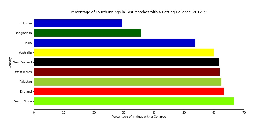
Collapses in the fourth innings in lost test matches create a perfect storm. Defeats create the biggest fallout in the media and the focus of the huge fallout falls on the last thing we saw: an England collapse.
The schedule - as explored above, playing test cricket in England leads to lots of collapses. That’s a fact for every team. Because England play in England more than anyone else (obviously), we see them collapse very often. They also play more test matches than anyone else (57 more innings than any other team since 2012), meaning that - even when the collapse rate is the same as other teams - the absolute number of collapses is higher. Humans don’t think well in terms of percentages, we think in absolutes. So even when England’s collapse rate is average, we still see England collapsing more than others simply because they play more.
Expectations - throughout this article I have made a point of comparing England to the average. But that is not how the England team is compared normally. The expectation - from fans, the media, and the team themselves - is for England to be one of, if not the, best test team in the world. Even the data that I am using, which generally defends England somewhat, does not put them anywhere close to being the best in the world. The likes of India, Australia, and New Zealand (the top three ranked teams in the world) generally feature towards the top of the graphs above. England might be around average in some of those metrics, but they are a long way from those three teams. In many ways, the current England team is a victim of the previous era’s success. The golden era from 2009-2012 was a period of unprecedented success that saw England rise to the #1 ranked team in the world. Ever since Strauss’ retirement, that has been the benchmark against which England have been measured. No matter how you slice it, this England team is nowhere near that level. Even a slight improvement in collapse rate would not diminish the feeling that this is a collapse-prone England batting lineup because it would still not compete with the previous era’s success. So, yes, according to the expectation of being the best in the world, this is an England team that collapses very often. Compared to average? Not so much, especially given the conditions in which they play.
Conclusion
This was a long article, with lots of detail, graphs, and numbers. So let’s sum up what we learned:
Since 2012, England’s collapse rate is 7th out of the top 9 test match nations.
The rate of collapses globally has increased since 2017, while England improved relative to the global average in that period.
When England do collapse, it usually comes when batting second (in the 2nd and 4th innings)
A lot of England’s high collapse rate is caused by playing most of their cricket in England, where conditions make collapses very common. Compared to their opposition, England do not collapse a disproportionately high amount when playing at home.
The feeling that England do collapse a huge amount is due to recency bias, timing (collapsing so often at the end of matches), playing often & mainly in England, and outsized expectation.
Thank you so much for reading! If you enjoyed, please subscribe to the newsletter and share with others. If you disagree with any of my points, or want to discuss more, please leave a comment or tweet me @UtdTait.
To view the code that I used to make this analysis possible, please see this Google Doc.
Nice analysis. Like to see it compared to the test teams of the late 1980s and 1990s - they knew a thing or two about collapsing!